Lately everyone's been talking about revitalizing villages and preventing "brain drain" into cities and across the border, but aside from a few TV shows and rare government incentives, no one is doing anything to provide a wide platform for people who want to go back to the countryside, let alone to popularize the very concept of returning to the countryside.
Bukva aims to be that platform. A digital search engine both for people who are curious about the concept of rural living, as well as people who are ready to move full-time, be they remote IT workers or retired blue-collar employees ready to dive into agriculture.
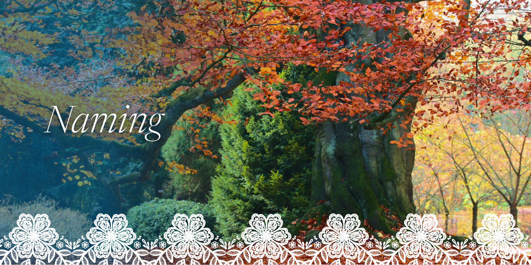
Since the project was built completely from scratch, even the name had to be created.
Bukva means "beech" in Serbian, and the name of this particular tree calls back feelings of nostalgia, tradition and countryside, hence the choice. Additionally, the word is relatively short and easy to pronounce internationally.
Note: All examples in this study are in English for ease of understanding. In reality, the target market is Serbia and the primary version of the website would be in Serbian.
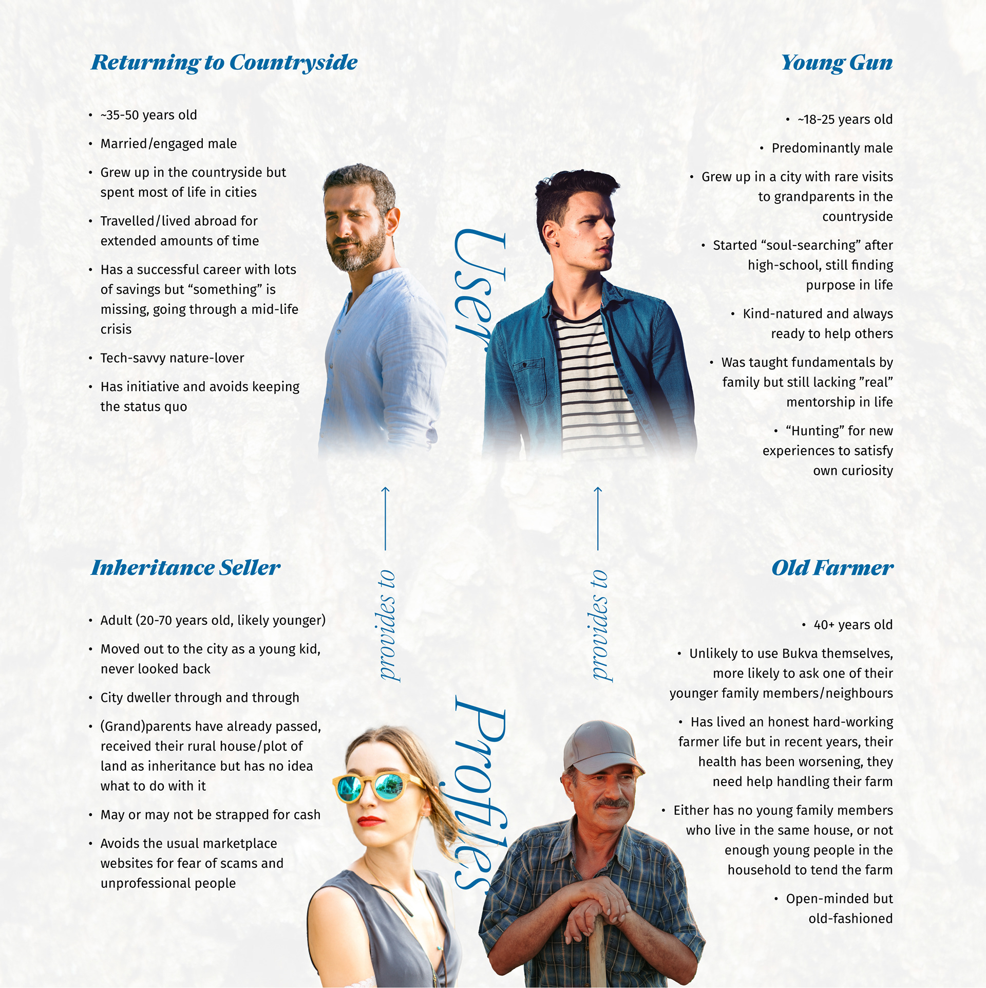
Above you can see the 4 distinct user profiles that Bukva's users are most likely to fall into. Bukva has two search pages: one for people finding volunteer work in farming households, and one for people finding a place in the countryside to move to.
Those are represented by the two users at the top of the graphic, while the users at the bottom are the providers, they will post ads on the website and attract buyers & volunteers.
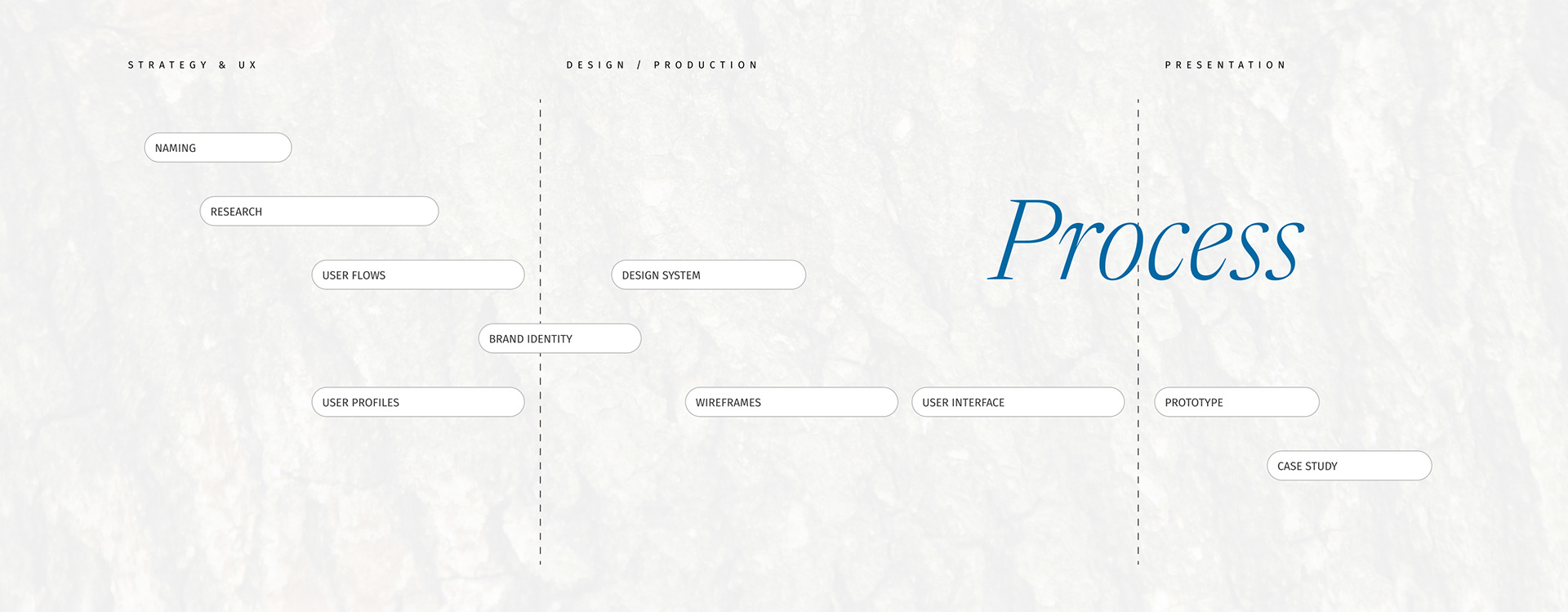
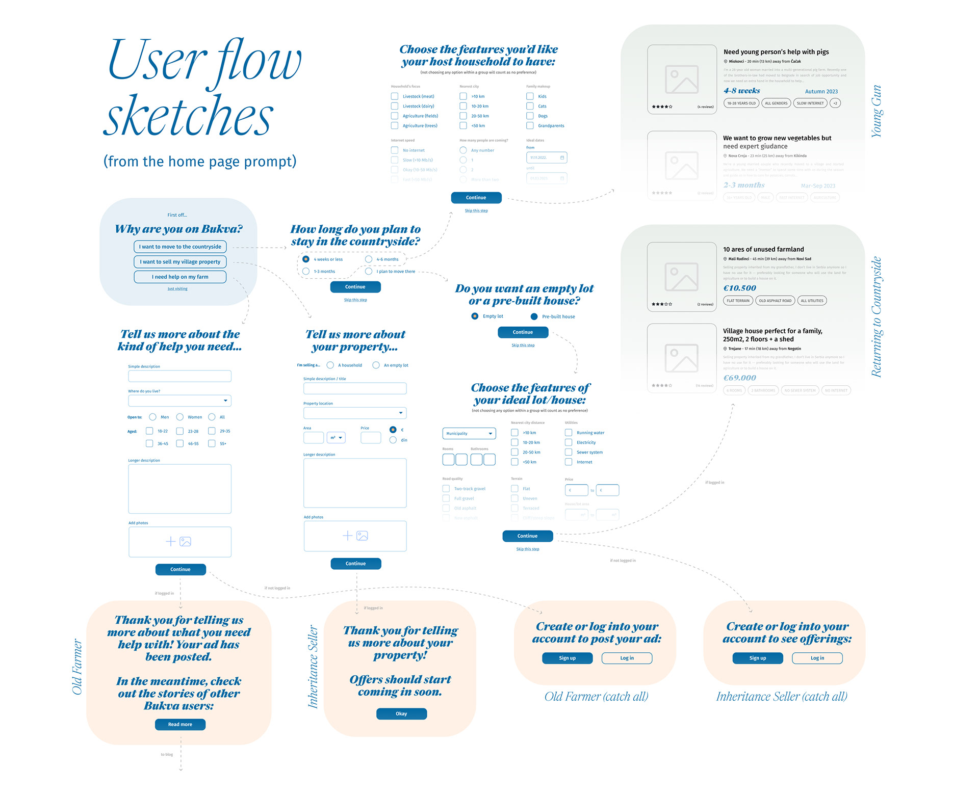
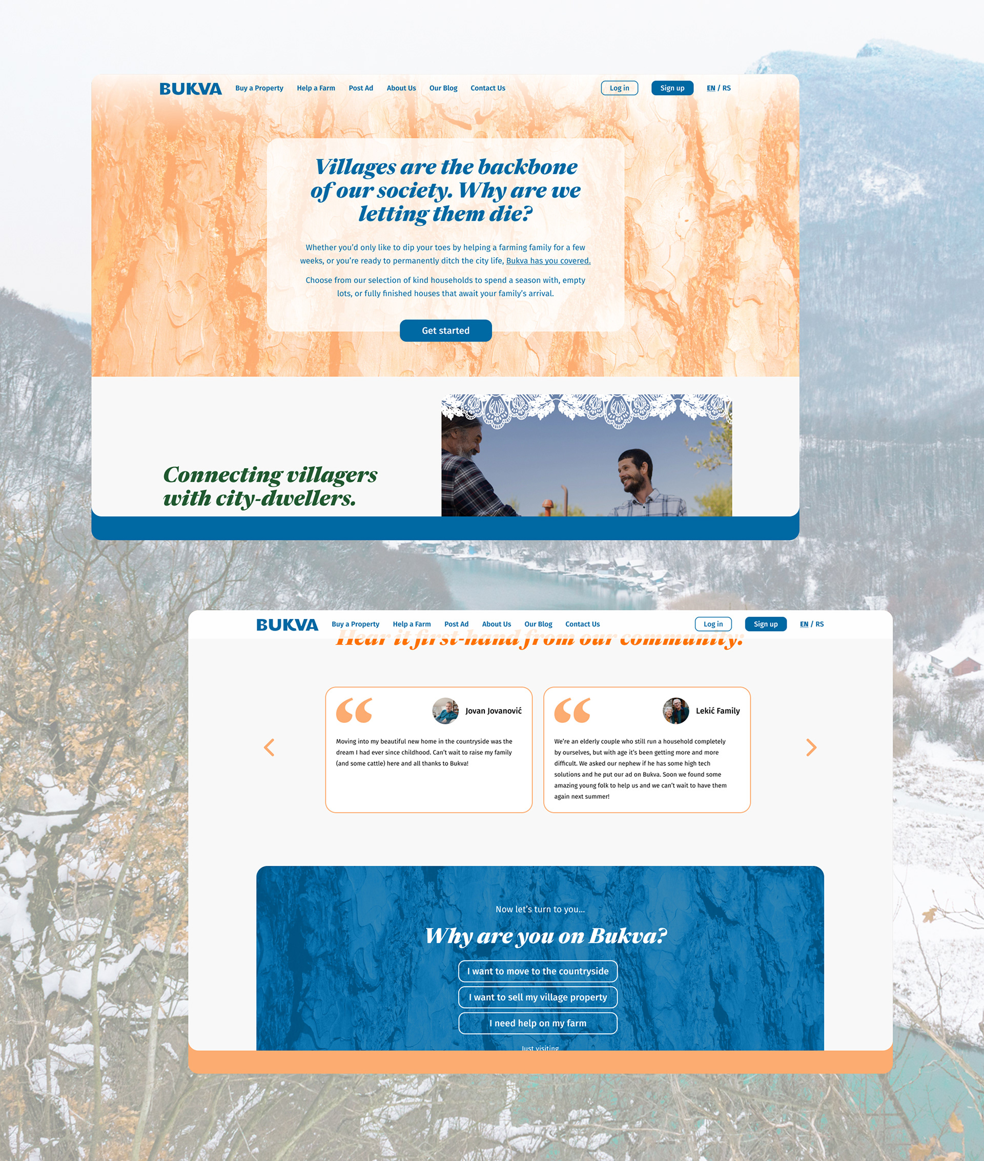
On the homepage, a simple, 3-answer prompt was designed to guide new users towards the part of the website that they need the most (the "Get started" button above the fold also leads to this prompt).
Below you can see a sketch of how the flow develops into 4 distinct answers to match the 4 user personas we have built up.
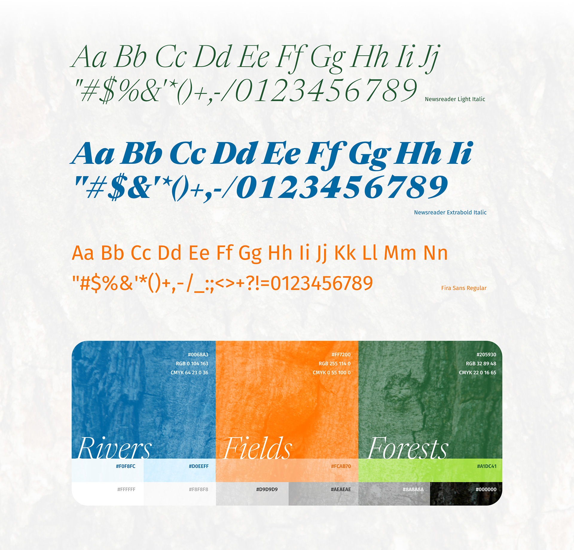
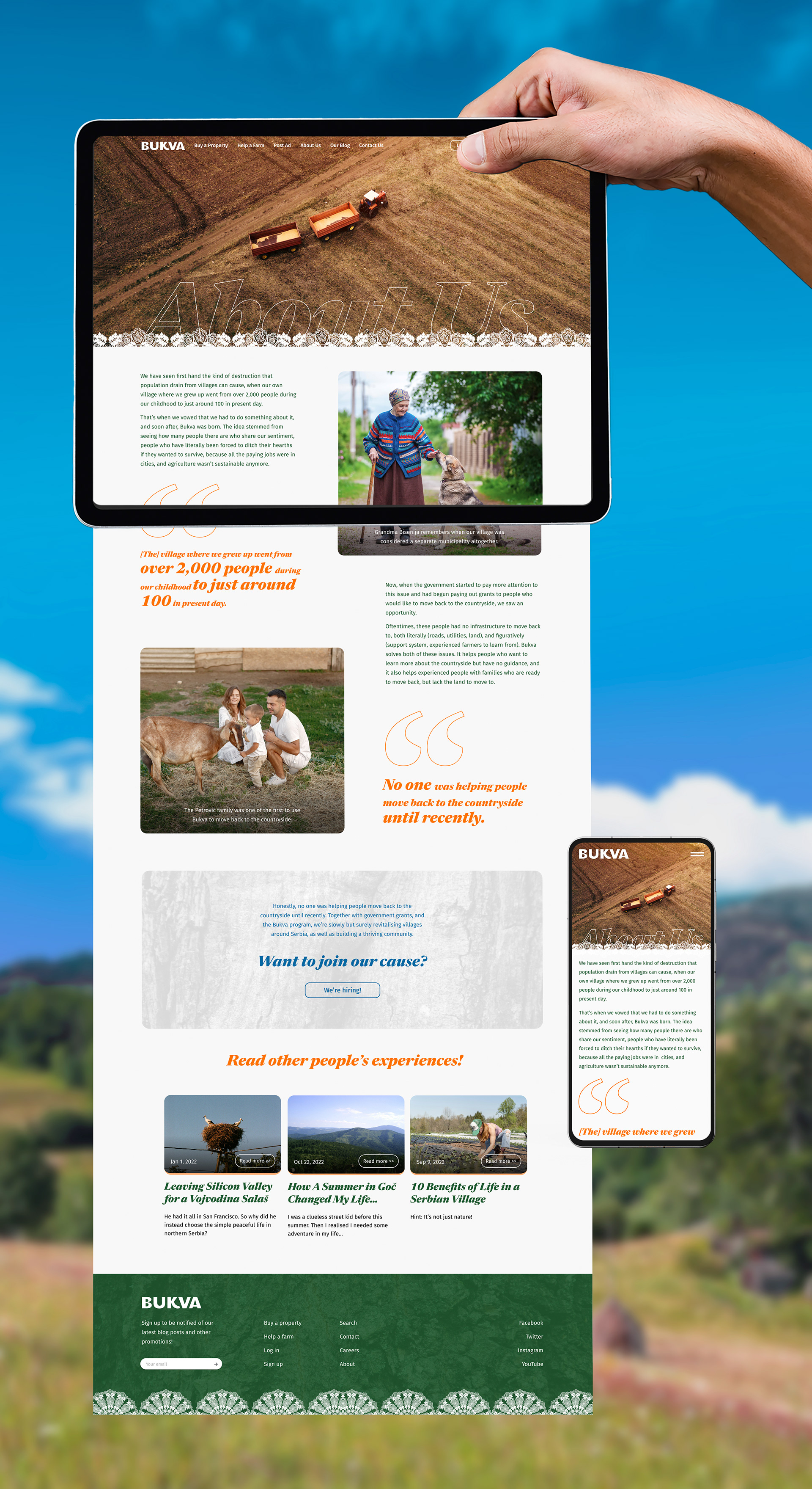
The color scheme was heavily inspired by nature and countryside: the blueness of rivers, as well as lakes and skies; the orange of wheat fields, but also the autumn leaves; as well as the greenness of forests and grass.
These colors are then overlaid with images of tree barks to further emphasize the nature theme. The neutral grays are there to help with UI readability.
For more complex brand application purposes, a lace pattern is sometimes added to the top or the bottom of an image as yet another symbol of rural tradition.

The design system you see in front of you is not exhaustive, but it encompasses the basics. The more complex italic serifs are used as titles and the more humanist sans serifs write out body copy as well as most of the UI.
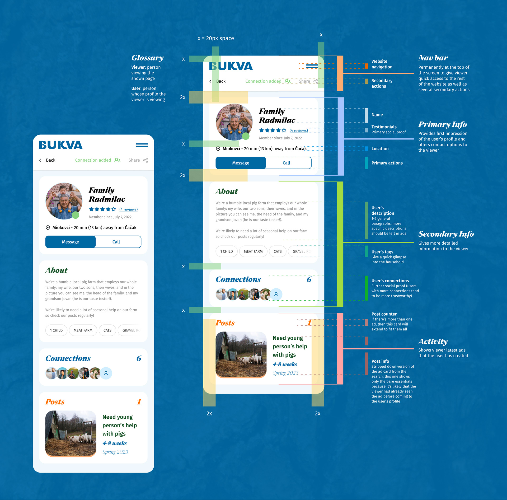
Speaking of UI, every detail down to the very spacing of the elements was carefully thought of and implemented, as can be seen in the analysis of the user profile page.
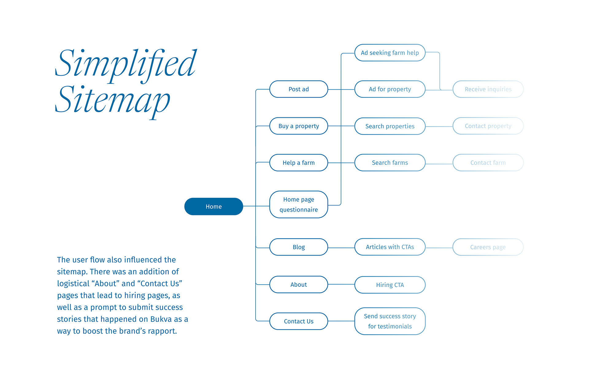
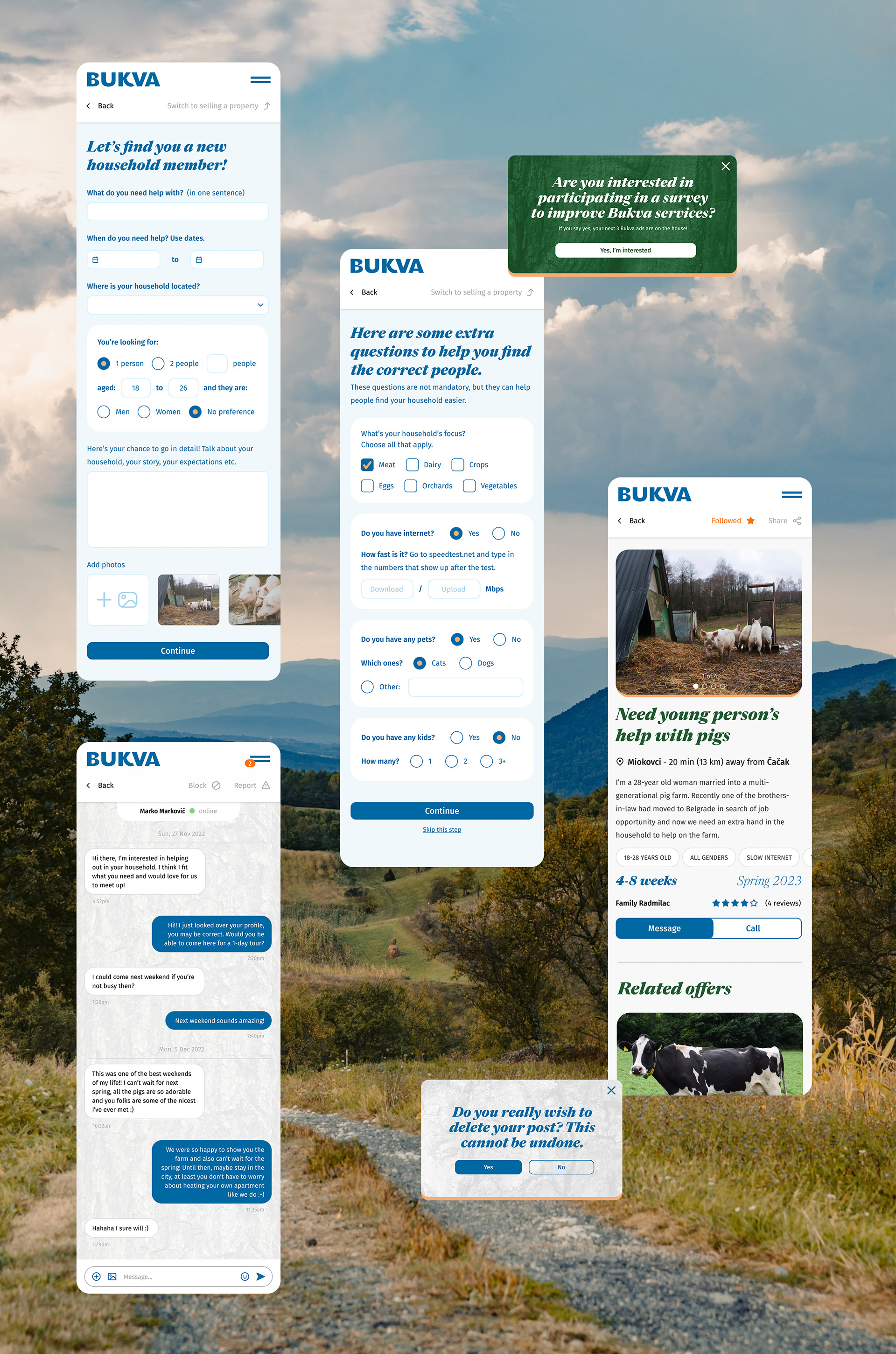
Bukva has two types of ads: Volunteering ads ("Help a farm") and typical real estate ads ("Buy a property"), and users aren't restricted to any single type.
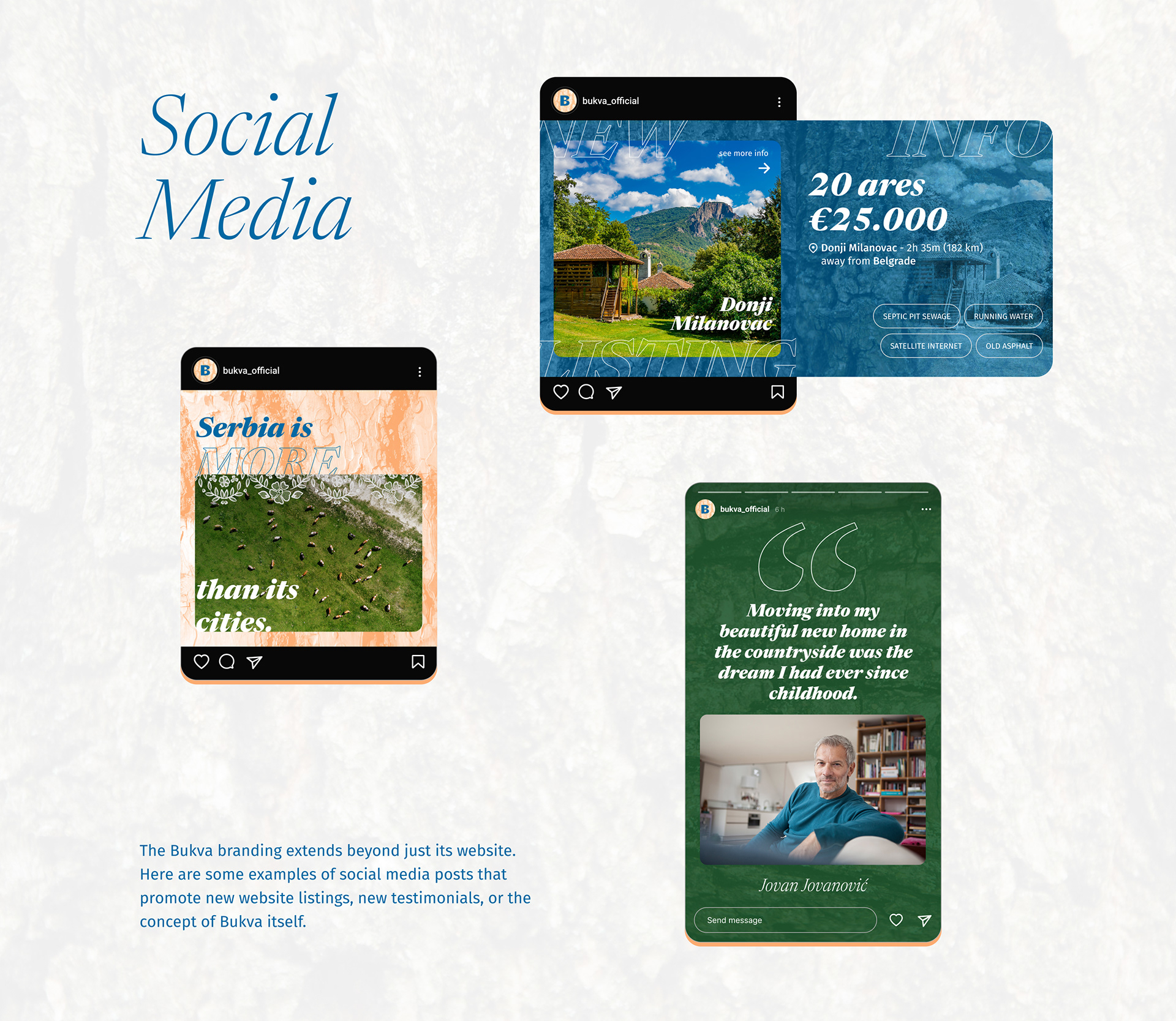
Below you can see some screens for posting volunteering ads, as well as some functional and marketing pop-ups. Bukva's main way of profit is charging a small fee for posting an ad, so offering free ad posting in exchange for user feedback is a win-win incentive.
It has been a blast working on this project with many learnings along the way. As for the state of Bukva, at the moment it's still in the conceptual phase, but one day we'll likely get to make it a reality, since the demand is already there; many people around me are getting sick (sometimes literally) of city life and looking for ways to go back to the countryside, even if only for a weekend.
As mentioned previously, Bukva can enable these people risk-free experience of the rural life through volunteer opportunities, but it can also assist those who have already made up their mind about permanently moving to a village.