REPLY42 prides itself on being lean and delivering results instead of the endless bureaucracy that plagues typical marketing agencies, their main motto being "measurable results in 4 months".
Art Direction
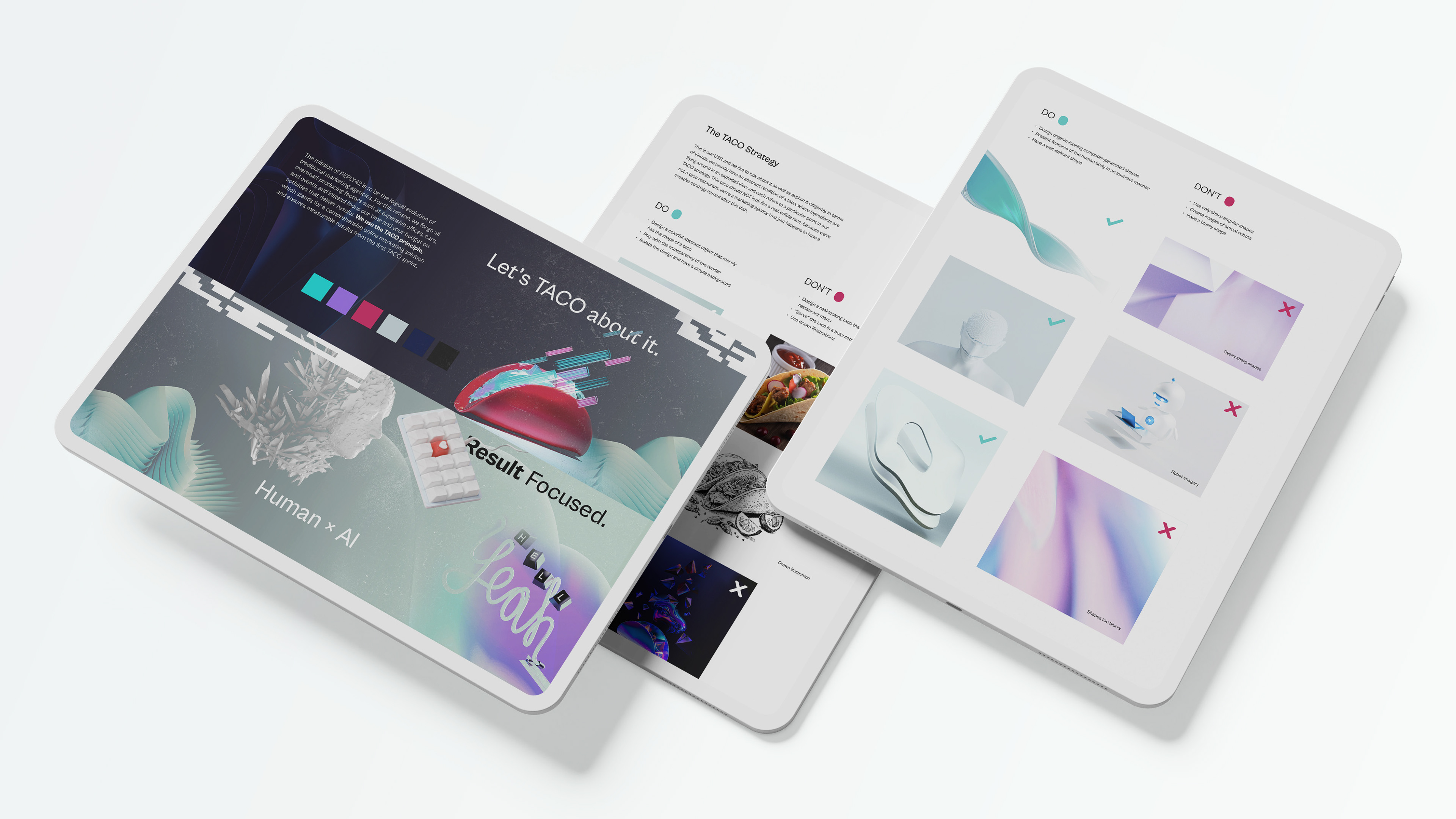
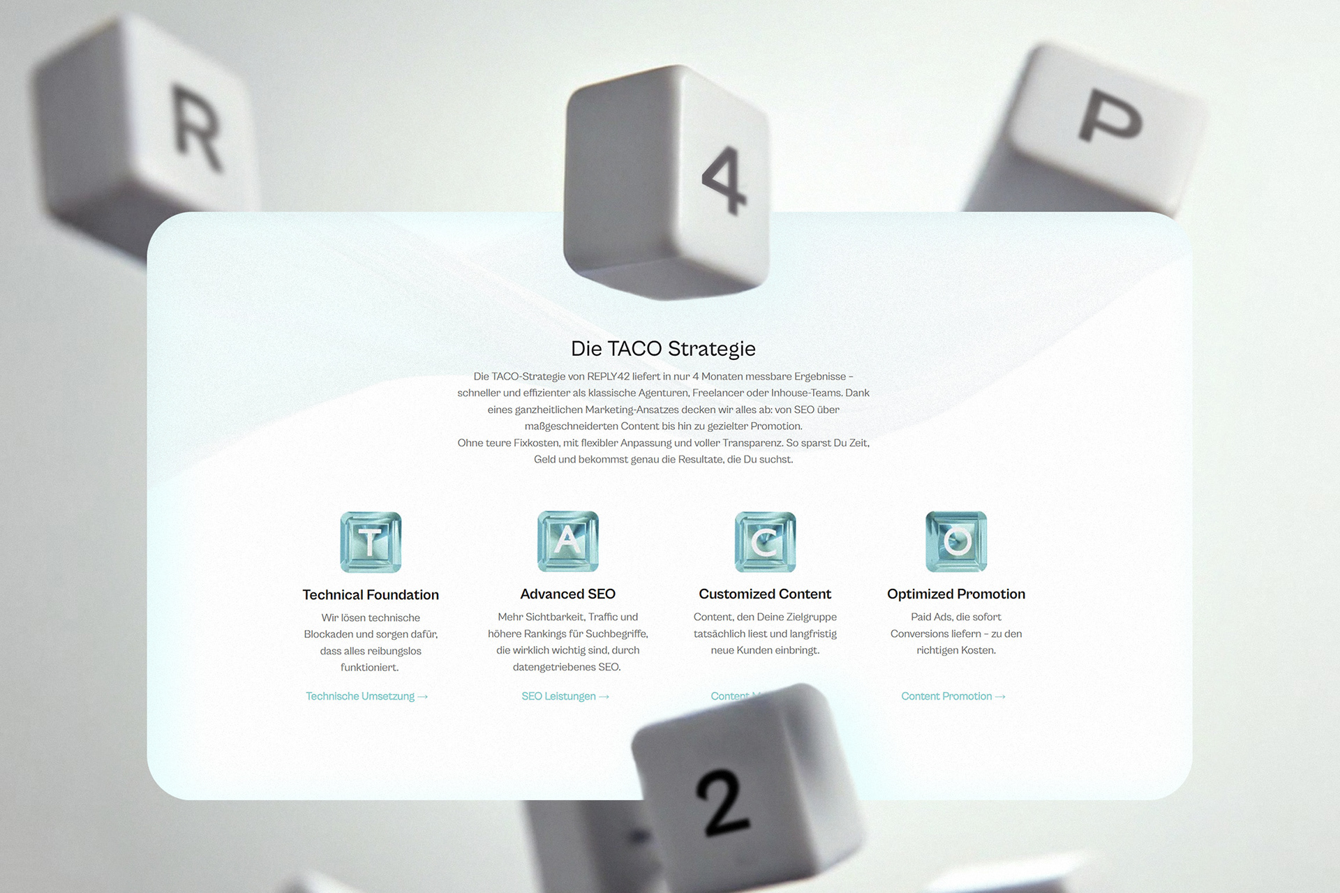
They use the TACO strategy, an acronym for a comprehensive online marketing solution and ensures measurable results from the first sprint. We knew from the start that we wanted to visualize this strategy through an image of a taco, but using literal taco images would make the whole agency look like a restaurant. Therefore...
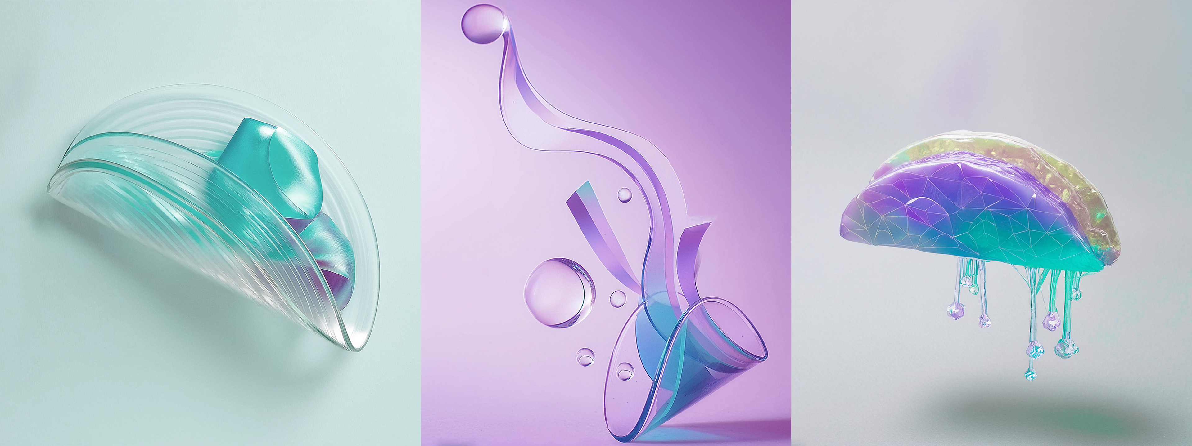
Enter: the digital taco.
↓

Here you can see how initial concepts of a digital translucent taco evolved into an infographic that explains the TACO strategy on the REPLY42 website.
While this visual of a free-flowing skeuomorphic taco definitely permeates the entire brand, it's not the only brand element, far from it.
From consultations with the client, we agreed that the art direction of the REPLY42 should lie at the intersection of human and machine—Human × AI.

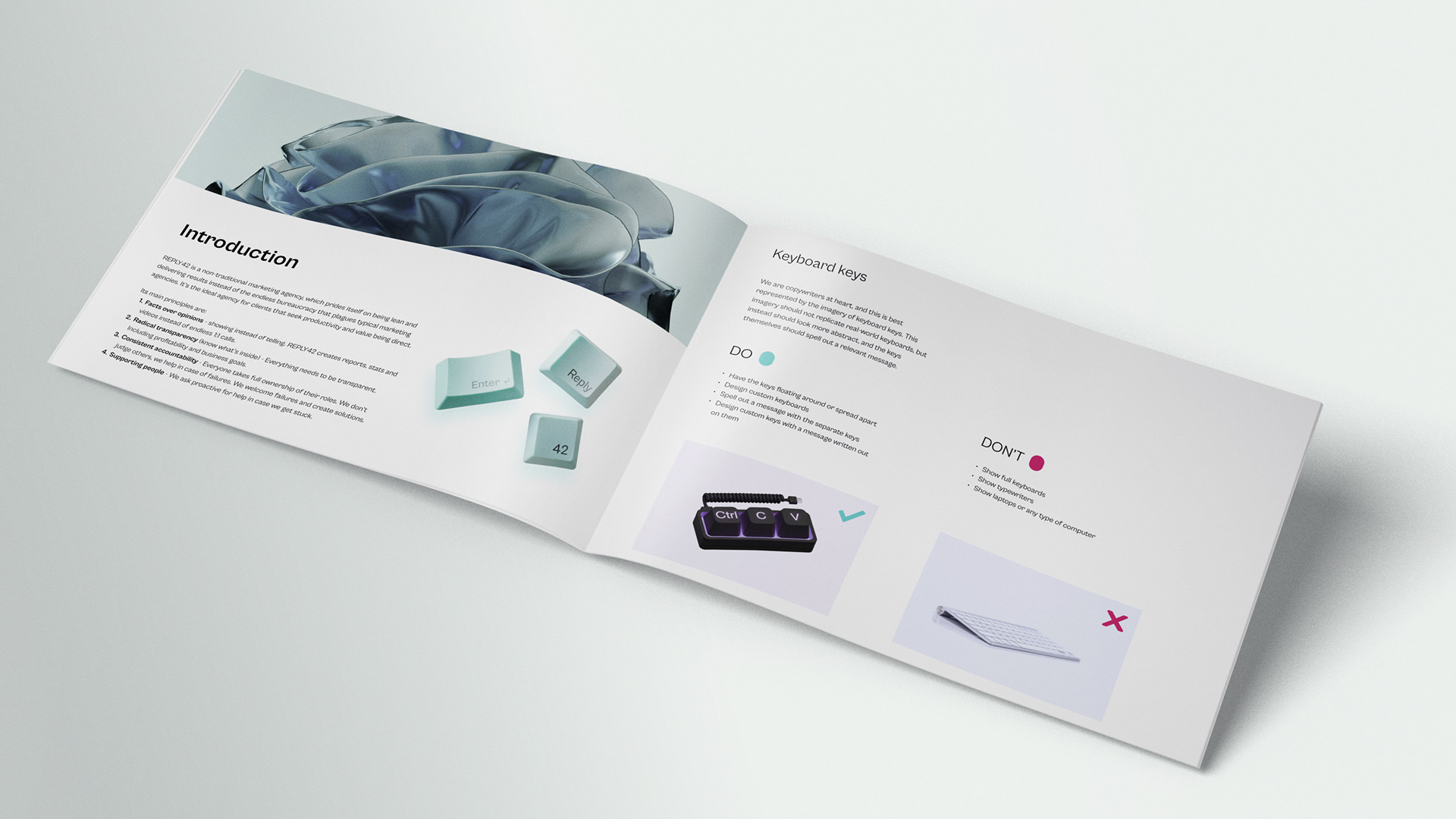
The final piece of the art direction is a nod to all the 21st century copywriters out there: a keyboard. However, we didn't want to just slap a picture of a keyboard and call it a day—that's just plain boring.
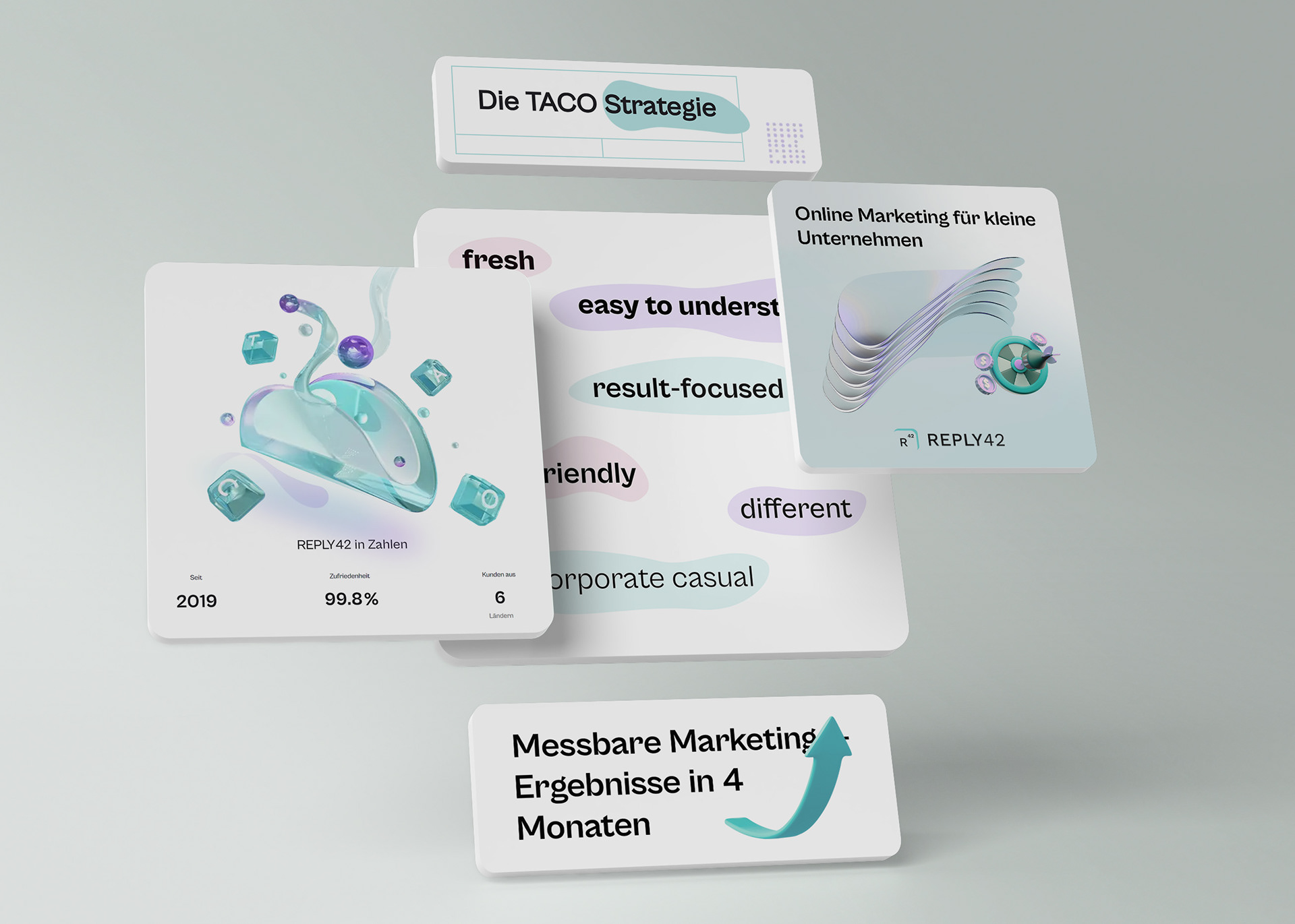
What we ended up doing instead are keyboard buttons, sometimes scattered around, and sometimes arranged in unusual layouts, that spell out various words and phrases (as you might have seen on the first image of this case study).
Excerpt from the REPLY42 website designed by another team according to the brand guidelines.
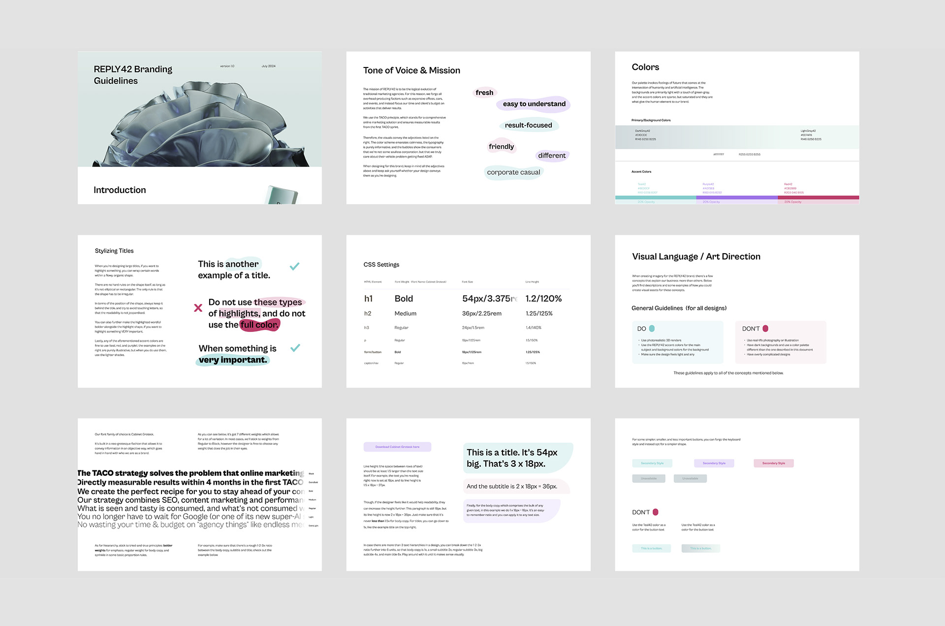
Brand
To guide the art direction of the brand, as well as more practical things like colors, typography and language, a comprehensive document was created.

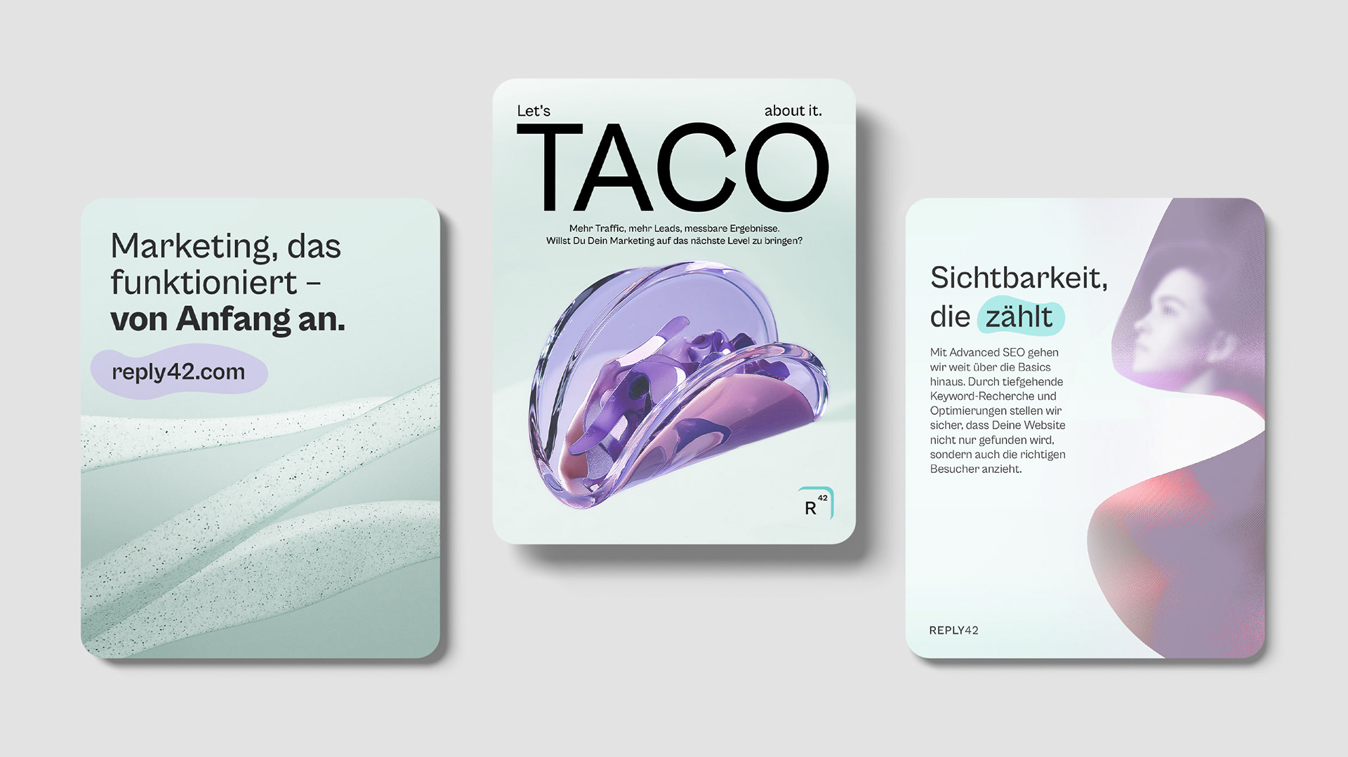
Above you can see some social media ad concepts. Currently most of REPLY42's own marketing is through word-of-mouth and Google SEO, but if they decide to expand to social media, their posts will look something like this.
Epilogue
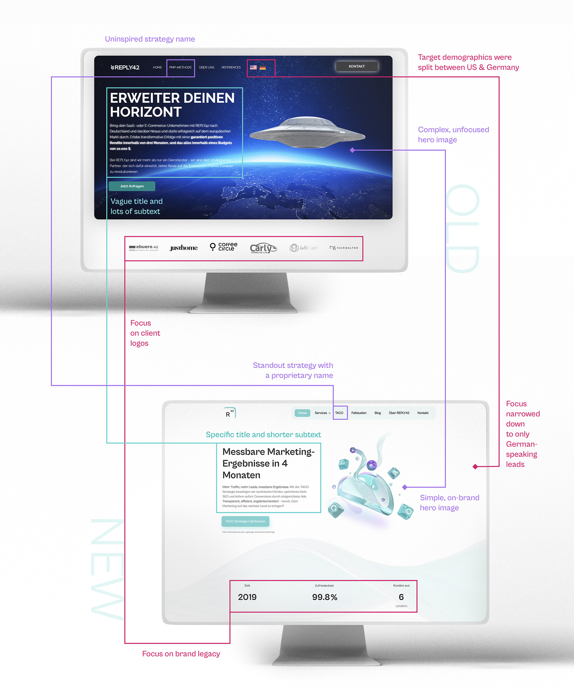
Visual example of how the brand redesign helped inform the website redesign and fixed key UX issues on the homepage.
This rebrand allowed the client to restart their content creation and do it in a way that's more consistent and on-par with their offering.
The website redesign also resulted in increased bookings since the layout was more simplified and focused on lead acquisition compared to the previous one.
Take a look for yourself: reply42.com
Disclaimer: For quicker conceptualization, parts of some images presented here were artificially generated.